A Nice-Looking Website Is Not the Same as One That Books Cars
Most car rental websites are built the way a brochure is built: a big photo of a car on a coastal road, a paragraph about the company, a list of vehicle classes, and a "Contact us" button. They look fine. They also send every interested visitor to a phone call or an email thread, where a good share of them quietly disappear.
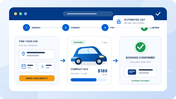
Good car rental website design starts from the other end. The question is not "does this look professional?" but "how many steps sit between a visitor landing on the page and a confirmed reservation?" This guide covers the nine elements that shorten that path, in the order a visitor encounters them, and the common design choices that quietly cost operators bookings.
The 9 Elements of a Car Rental Website That Converts
1. A search widget above the fold
Pickup location, pickup and return dates and times, and a "Search" button — visible the moment the homepage loads, on both desktop and phone. This is the single most important element on the site. If a visitor has to scroll past a slideshow or open a menu to find it, a share of them never will.
2. Live availability and a real price
The search has to return vehicles that are actually available on those dates, with an all-in price, not a "starting from" figure that changes at checkout. This requires a website connected to a real booking engine, not a form that emails the office. Quotes that arrive the next morning lose to competitors who confirmed in thirty seconds.
3. A fleet page that sells, not just lists
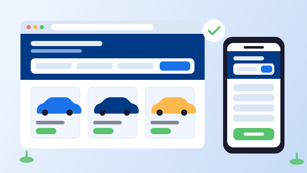
Each vehicle class needs real photos of your actual cars (not stock images of a different trim), seat and luggage capacity, transmission, fuel type, and a "Book this car" button that carries the visitor's dates through to checkout. A fleet page without a booking button is a catalog, not a sales page.
4. A mobile-first checkout
Much of your traffic is on a phone, often from an airport, a hotel lobby, or a taxi. The booking form needs large tap targets, as few fields as possible, autofill-friendly inputs, and a payment step that works with a thumb. Test the full flow on a real phone, not a resized browser window.
5. Transparent pricing and terms
Deposit amount, mileage allowance, fuel policy, insurance options, and cancellation terms should be visible before the payment step. Surprise fees at checkout are the most common reason a booking is abandoned at the last screen — and the most common reason for a one-star review after it isn't.
6. Trust signals near the booking button
Reviews, years in business, a physical address, a phone number that is answered, and secure-payment badges belong next to the "Book now" button, not buried on an About page. A visitor about to enter a card number is looking for a reason to trust you at exactly that moment.
7. Location pages with real content
If you serve more than one city or airport, each location deserves its own page with the address, hours, pickup instructions, a map, and its own search widget pre-set to that location. These pages are also what search engines rank when a renter searches for a rental in that city or airport.
8. Multilingual and multi-currency booking
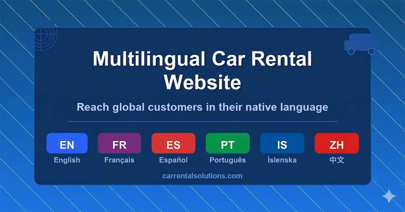
Operators in tourist markets lose international renters at the terms page, where a visitor who cannot read the deposit policy simply closes the tab. A multilingual reservation system that shows prices in the renter's currency removes that friction. The guide to multilingual car rental websites covers what that changes in bookings.
9. Speed
A page that takes five seconds to load on a phone is a page many visitors never see. The usual culprits are full-resolution fleet photos, autoplaying video, and a stack of third-party scripts. Compress images, lazy-load anything below the fold, and load only the analytics you actually use.
"A car rental website has one job: turn a search into a confirmed reservation. Every design decision either shortens that path or lengthens it."
Design Choices That Quietly Cost Bookings
Some patterns look professional and still hurt. A full-screen video hero that pushes the search widget below the fold. A "Request a quote" form instead of a live price. Stock photos of vehicles you don't rent. A phone number as the only way to book after hours. A booking flow that opens in a separate, differently branded window that looks like a different company. Each one adds friction or doubt at the moment the visitor was ready to commit.
The fix is rarely a full redesign. It is usually moving the search widget up, connecting it to real availability, and removing the steps between "search" and "pay". The post on what a booking engine is explains the piece that makes that possible.
Building It in 5 Steps
-
1
Start with the booking engine, not the theme
Choose the reservation system first and confirm it can embed a search widget and full checkout on your domain. The design is built around that, not the other way round.
-
2
Put the search widget above the fold on every key page
Homepage, fleet page, and each location page get a search box visible without scrolling, with dates and location pre-filled where the context allows.
-
3
Photograph your real fleet
One clean exterior and one interior shot per vehicle class, on the same background, compressed for the web. Replace every stock image.
-
4
Surface terms and trust signals before payment
Deposit, fuel policy, mileage, insurance, and cancellation terms appear on the vehicle selection screen; reviews and contact details sit next to the book button.
-
5
Test on a phone, then measure
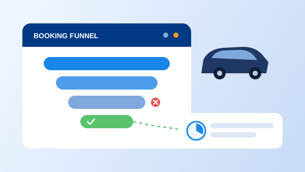
Complete a booking end to end on a real mobile device. Then set up conversion tracking so you can see where visitors drop off and fix that step first.
What Changes When the Design Serves the Booking
Visitors book instead of calling
A live price and a working checkout turn the after-hours visitor who would have emailed — and then booked elsewhere — into a confirmed reservation.
Fewer abandoned checkouts
Terms and fees shown before payment remove the surprise at the last screen that sends renters back to a search engine.
International renters stop leaving at the terms page
Language and currency in the renter's own terms means the booking flow works for the traveler, not just the local customer.
Each location earns its own traffic
Dedicated location pages rank for local searches and let renters book the right branch without a phone call to confirm.
You can see what to fix next
With tracking in place, the design stops being a matter of taste and becomes a series of measurable improvements to a funnel.
A design only converts if the booking behind it works. The layout is the visible half; the other half is the car rental software supplying real-time availability, pricing, and confirmations to the page.
Frequently Asked Questions
The search widget on the homepage. Pickup location, dates, and times should be visible without scrolling and should return live availability and a real price. Everything else on the site — the fleet page, photos, reviews — exists to support that one action. A site that hides the search behind a menu or a contact form loses most visitors before they see a single vehicle.
Either can work, as long as the booking engine is built in rather than bolted on. A well-structured template connected to a real reservation system will outperform a beautiful custom site that ends the booking flow at a contact form. Start with the booking engine, then choose the design that presents it best.
Aim for a usable page in under three seconds on a mobile connection. Rental customers are often searching from a phone, sometimes from an airport or hotel with poor signal. Large hero images, unoptimized fleet photos, and third-party scripts are the usual causes of slow load times.
If a meaningful share of your renters are travelers from other countries, yes. A visitor who cannot read the terms or the price breakdown is unlikely to enter a credit card. Multilingual booking with prices shown in the renter's currency removes that friction and is one of the highest-return additions for operators in tourist markets.
Measure it. Set up conversion tracking so you can see how many visitors start a search, reach checkout, and complete a booking. The drop-off between those steps tells you exactly which part of the design to fix. Without tracking, every redesign is a guess.